I built a game in 48 hours, not to ship it, but to stress-test AI as a design partner, and to understand how I'd lead design teams through AI before I had to.
Here's what actually happened.
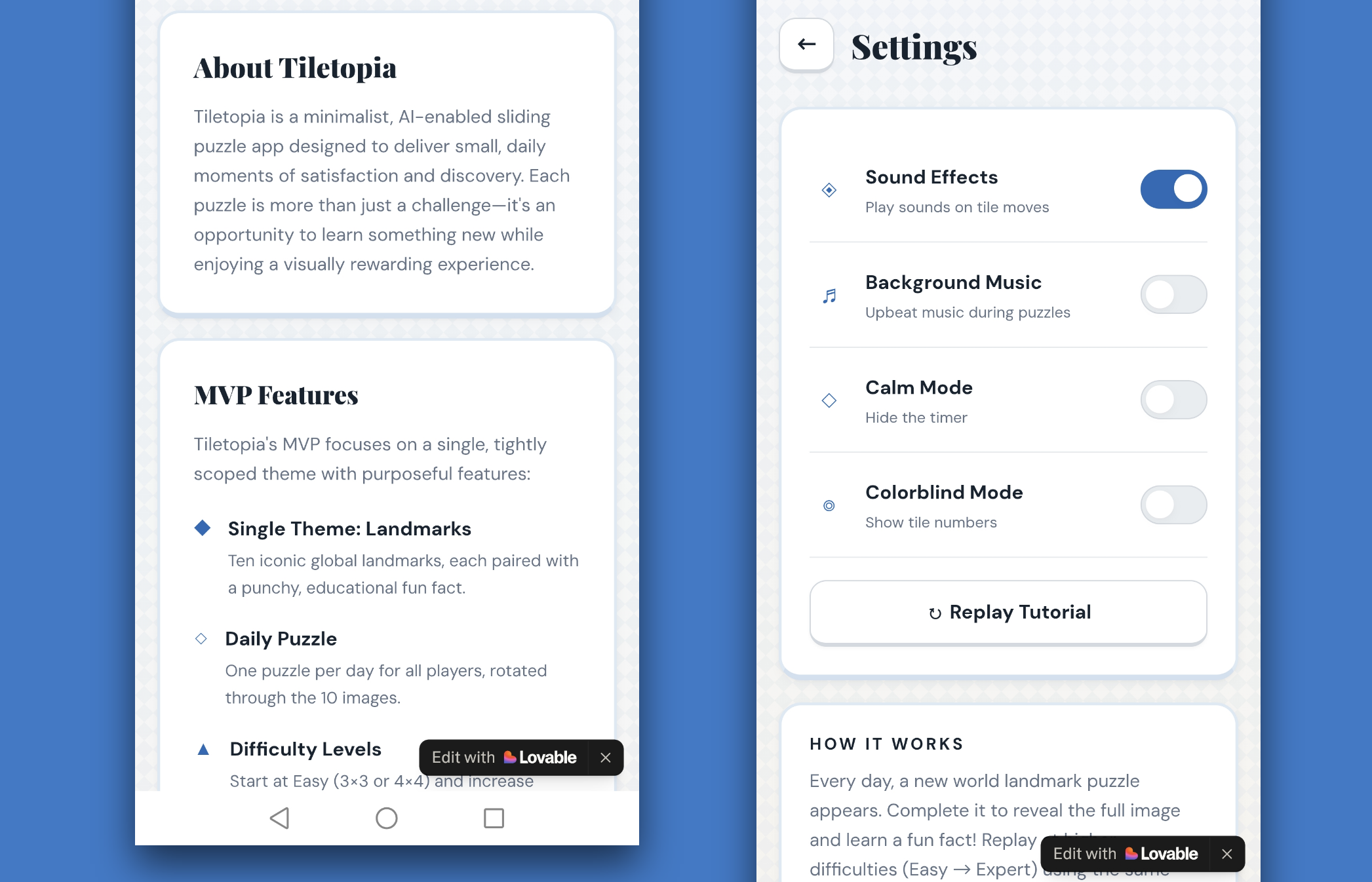
Most design leaders are forming opinions about AI from the outside. I wanted mine from the inside. So I gave myself 48 hours, a blank brief, and no safety net. I built a sliding puzzle game called Tiletopia, not because I wanted to ship a game or something polished, but because I needed a real creative process to stress-test. One where AI was a genuine partner, not a demo. One where the decisions mattered enough to reveal something true and help me understand how generative AI could support design judgment, speed up iteration, and shape product thinking.
What I found reshaped how I think about leading design teams in a world where AI is already part of the process, whether leaders are ready for it or not.
Three things became clear that I didn't expect going in:
1. AI accelerates decisions, which means it accelerates bad ones just as fast as good ones. Without strong judgment upstream, speed becomes a liability.
2. The hardest leadership challenge isn't adopting AI, it's knowing what to protect from it. Emotional tone, user trust, scope, and the cultural references that make something feel human and original. None of that lives in the model.
3. Design leaders who haven't worked hands-on with AI yet are already behind. Not because the tools are mature (they're not), but because your teams are using them with or without your guidance.
What follows is an honest account of what happened. Where AI helped, where it pulled me in the wrong direction, where I lost track of what was mine, and what I'd do differently leading a team through this.
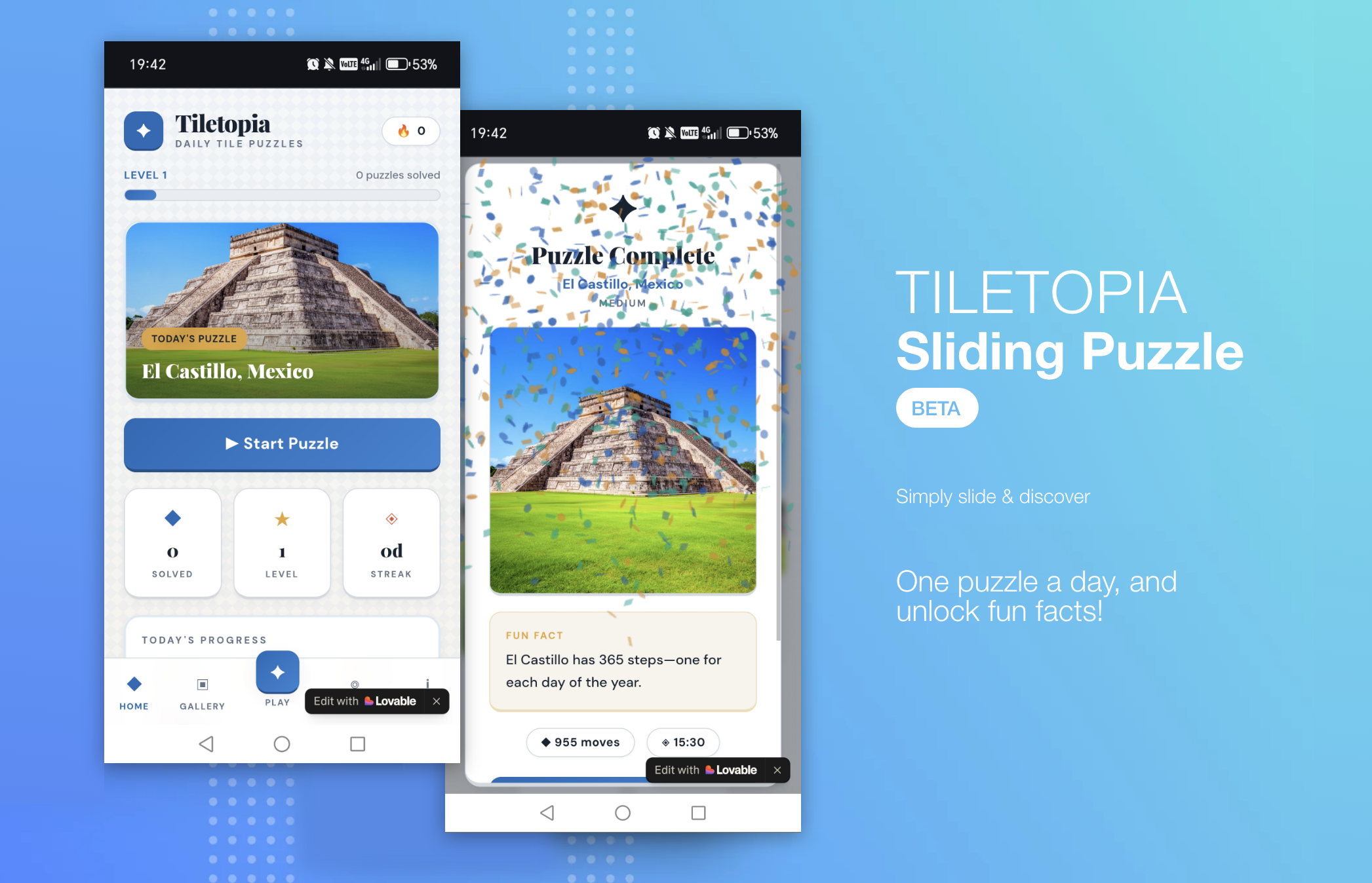
I framed the brief clearly: one theme, a daily puzzle, replay mechanics. The experience I had in mind was specific. I wanted it to feel nostalgic, like a childhood puzzle pulled out on a rainy afternoon while relaxing. Quiet satisfaction. Something you'd return to not because it demands your attention, but because it earns it.
What I didn't anticipate was how nonlinear the process would actually be. My chat history with ChatGPT (co-brainstorming partner) tells a very different story to the clean experiment I'd described to myself afterwards. Over thirty back-and-forths. The concept shifted from user-uploaded photos to curated image packs. Grid sizes changed repeatedly. At one point I just typed "change of plan" and deliberately narrowed everything to a single theme, ten images, one daily puzzle.
Not because I'd run out of ideas, but because I realised that proving the experience mattered more than building the product. That decision shaped everything that followed.
I leaned on ChatGPT throughout as a co-brainstorming partner; scoping what was realistic, mapping the daily loop, exploring difficulty and reward mechanics. For assets, I generated images and curated them based on clarity, contrast, and how well they'd work when split into tiles. The split felt clean in theory: AI would accelerate the output, my human judgment would decide what lands.
This is where it got interesting. Not because the division was clean, but because of where it broke down.
AI contributed:
• Rotation logic and initial difficulty structure
• Personalisation concepts and puzzle (grid) layout variations
• Fast iteration on fun facts and mechanics
• An unprompted accessibility feature (numbered tiles for visually impaired people that I hadn't asked for, but made me think harder about inclusive design than I would have otherwise)
I controlled:
• Themes and asset selection
• The core experience intent: nostalgic, calm, discovery-led
• Scope and constraints: what stayed out mattered as much as what went in
• Theme, asset curation, and the cultural references that shaped the aesthetic
• Every decision tied to habit formation, emotional tone, and trust
Where AI genuinely helped
• Brainstorming mechanics and flows quickly
• Rapidly generating variations to pressure-test ideas
• Testing multiple difficulty models in minutes rather than days
Where it was wrong or risky:
• Overly complex grids (7×7 and 8×8) that broke the habit loop by being too hard
• A bland, emoji-heavy UI that signalled noise instead of calm
• Multi-theme systems that would have diluted the MVP before it proved anything
• Fun facts that needed human checking (AI's confidence is not the same as accuracy)
The clearest lesson: AI isn't inherently trustworthy. Every hallucination became a design lesson; but only because I was paying attention.
The first versions of Tiletopia were littered with emojis. Used in bullet points, in headings, just everywhere! They felt immediately wrong. The game was meant to evoke calmness and discovery; the feeling of completing something beautiful. The emojis said something else entirely: loud, chatty, and frantic.
I pushed back and asked for something more modern and timeless. What came back felt clinical and cold. So I pushed further, this time with something specific. I'd been to Portugal and became aware of Azulejo tiles: geometric, handcrafted, quietly beautiful. For a game called Tiletopia, it felt almost too obvious. The aesthetic worked, not because AI discovered it, but because I brought the reference from somewhere real. The AI didn't have that memory. I did.
This came up again when AI recommended Sports as the strongest MVP theme due to clear silhouettes, and them being easy to source. Objectively sensible, I agree. But having looked up various image collections, I'd already decided on World Landmarks. I'd thought carefully about what discovery feels like as an experience: unlocking somewhere real, learning something true, the satisfaction of a place revealed tile by tile. Sports couldn't carry that as much. It shaped the emotional logic of the whole game, including the language. Changing it to "Today's Discovery" instead of "Today's Puzzle." "Discovery Unlocked" instead of "Completed." Small changes, but they came from a human decision about what the experience was actually for.
The difficulty curve told a similar story. AI suggested 7×7 and 8×8 grids for harder levels. Logically, it made sense. However in practice, the first few of people gave up after level 4 when I gave it to them. What was meant to be a light hearted daily challenge became effort in the wrong direction. The stops daily habits forming. That failure led directly to the hint system idea: not something I'd planned, but a direct response to watching AI logic collide with how real people actually behave.
Sound was the most persistent struggle. The first audio felt like an alarm. When I asked for relaxation it swung so far the other way it felt like a meditation app for people already asleep. When I asked AI to choose a royalty-free calm track, it listed sources and told me to pick one myself. AI could describe what I needed. It couldn't make the judgment call about what actually felt right. This failure produced something useful: making audio toggleable, giving users control rather than forcing them into whatever mood the game had decided on.
There was one moment where AI did something I hadn't asked for and it genuinely made me think differently. Adding numbered tiles as an accessibility feature for visually impaired people, unprompted.
I want to be honest about how I frame this. The feature has not been tested against WCAG standards. I don't know if it actually helps those who need it, or whether it does so in the right way. Shipping an untested accessibility feature is not the same as building an accessible product. But what AI did was prompt me to think more seriously about something I'd deprioritised.
This is the tension I found the hardest to resolve: AI can open up thinking you wouldn't have done yourself, but it can also create a false sense that something important has been handled. Those are very different things, and as a leader, the responsibility for knowing the difference sits with you, not the tool.
There were moments in this project where I genuinely couldn't tell where the AI's thinking ended and mine began. The first version of the collection screen appeared almost fully formed from Lovable, and because it looked like what I'd seen before (didnt challeneg the norms), I didn't question it. I just accepted it.
It was only later, when I asked for a horizontal progress bar and blurred locked images, that I felt something shift. Those were specific, deliberate choices overriding defaults and asserting my point of view. The blurred images in particular felt mine: a way of showing that something is there to be uncovered without spelling it out. It wasn't one big moment of reclaiming ownership. It happened gradually, through the decisions where I pushed back and the output changed because of my judgment, not the model's.
This is something every design leader needs to watch for in their teams. When AI generates something that looks right quickly, people stop questioning it. Things look good, decisions feel made, but if you're not careful, you are curating rather than creating. Spotting that distinction before it reaches stakeholders is a leadership responsibility, not a craft one.
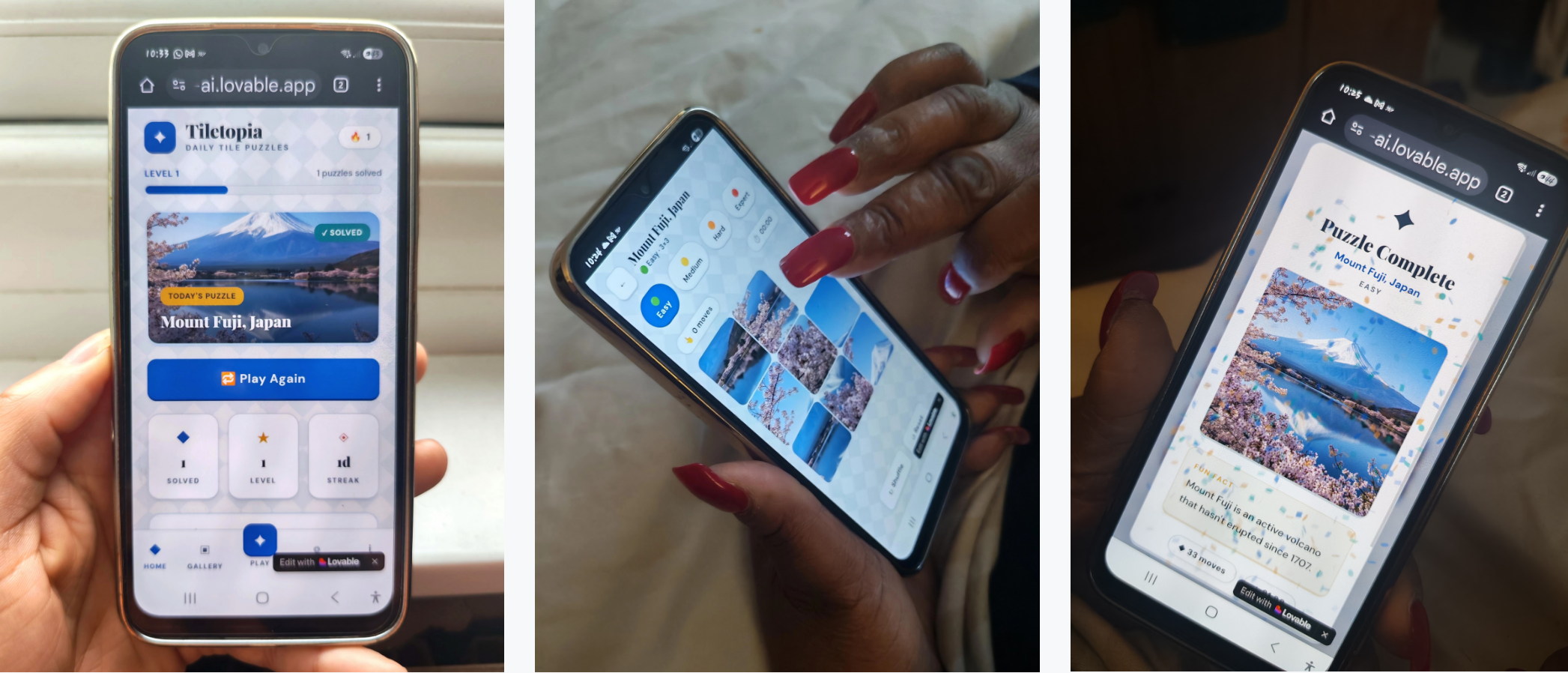
I'll be straight about the numbers. Of 20 users, only 3 came back the next day. Only 1 played consistently over 6 to 8 days. That's a weak retention signal for something built around a daily habit.
Some of this was a distribution problem, several people had saved the game as a WhatsApp link buried in their messages, not as an app on their home screen which may have prompted them to play more. The difference in daily pull is significant! But one user made a more pointed observation: "replaying the same puzzle at a harder difficulty felt like a cheat when the fun fact didn't change or show a deeper fact. I've already read it". The reward felt hollow.
I think both things are true. There's a distribution problem, and the loop itself needs some more work. I'm not going to frame thin retention as a success just because the project goal was process over product. It didn't land the way I'd hoped, and that's actually the more useful finding.
This didn't just test AI as a tool. It reshaped how I think about leading design in an AI-first environment. If I were leading or advising a design team starting out with AI today, here's what I'd do:
• I’d institutionalise AI as a co-pilot / design partner while preserving judgment, checkpoints and review processes needed to cover the whole creative journey. Prompts, assumptions, and decisions made along the way, not just the final screens. Doing this experiement, I had to go back through my own chat history to understand what I'd actually decided versus what had just happened by default. Leaders need to build that kind of visibility into how their teams work with AI.
• Team structure will change. Senior designers become judgment curators. AI handles volume, iteration, speed, and low-risk ideation. I think this leads to smaller design teams with more AI leverage, not larger ones. The value shifts from output to oversight.
• Quality needs guardrails before work starts, not after. Without clear principles and constraints set upfront, AI will fill the space with whatever is statistically likely, not what is right for the product. I experienced this directly with the emoji UI, the over-complex grids, and the initial generic theme sound. The guardrails I didn't set out early cost me time later.
• Hiring will shift. I think the designers who will matter the most are those who can challenge AI output from a strong human-centred position, people who can bring real taste, real references, and real knowledge of users and design sensitivities. That's harder to screen for than portfolio craft, but it's what will actually determine quality.
• Trust becoming more of a design responsibility. As AI realism increases through better deepfakes, synthetic content, AI-generated experiences, people are becoming more sceptical about what's real and what's manufactured. Designers will need to actively safeguard credibility and build trustworthy experiences, not just usable ones. That's a leadership concern, not just a craft one.
However for me, one tension stands out above all: AI is very good at remixing what already exists, and its speed can easily be mistaken for originality. But without strong judgment, and a genuine point of view that comes from real experiences designers and teams risk producing work that is fast, familiar, and quietly average. At scale, that's a serious problem, and it's one that design leaders, not AI tools, are responsible for preventing.
• To reduce low-level manual work allowing designers to focus design more on strategy, principles and orchestration.
• Protect scope, simplicity, and user centered decision-making, (especially in MVPs).
• Reinforce across the team that AI amplifies design decisions; it doesn’t replace them or real user insight
• To build AI competency arrange short experiements like this, small, short & constrained where we as humans own quality and direction.
This wasn't about building a sliding puzzle. It was about working out how I'd lead design responsibly in a world where AI is already part of the process, and what changes when it is.
The honest summary: it was messier than I expected, more nonlinear than I'd admit in a presentation, and full of moments where I had to reclaim ground I hadn't realised I'd surrendered. The music still isn't quite right. The loop needs some more work. The accessibility feature raises more questions than answers. And somewhere in the middle of it all I lost track of what was mine, and had to find my way back to it deliberately.
I'm genuinely excited about what AI makes possible in design and for people. But I've moved from theoretical caution to real caution. Caution that comes from having actually done it and seen where it pulls you if you're not paying attention.
AI accelerates ideas and iteration. It also accelerates risk. Judgment is the real differentiator, and this experiment showed me exactly what happens when you let it slip, and what it takes to get it back.
Beta is still ongoing: 5 of 20 users over 7 days. Happy to add more testers.
