Briteyellow had the technology. What they needed was product direction.
Briteyellow had built impressive indoor positioning and augmented reality (AR) navigation to help people find their way around train stations. But the app was being shaped by what the technology could do, not by what passengers needed.
As the Design Manager I worked across Briteyellow, a brand design agency and rail staff. I coached Briteyellows highly technical team in user-centred design, found and briefed the outside agency, and guided four rounds of research with older adults. When the agency left early, I stepped up as interim Head of Design and moved from coaching to hands-on delivery to keep the project on track.
Outcome:
Six commercial bids secured with Transport for Wales and ten more UK stations in the pipeline. Briteyellow went on to keep developing the product with the rail industry, with a design and research budget set aside for future work.
*This project began in the Royal College of Art's Design Age Institute programme, where I supported five organisations to build design capability and make better product decisions. Briteyellow was the one where I stepped in more deeply.


Briteyellow's strategic business goal was nationwide adoption by every rail operator. The first step was a business case for the Department of Transport Wales, and the Rail Delivery Group.

The technology was ahead of the experience. Technical language, fragmented navigation and three separate software platforms made the app (Briteway) hard to understand. For someone already anxious in an unfamiliar station, that made things worse. In early testing, people called it "technical" and "unusable", and some worried they would get stuck mid-journey.
Several pressures made it harder to fix. A commercial opportunity had put the team on a tight deadline. Relationships between the teams became strained and decisions were becoming fragmented. My job was to give them enough clarity to make good product decisions quickly, without slowing that opportunity down.
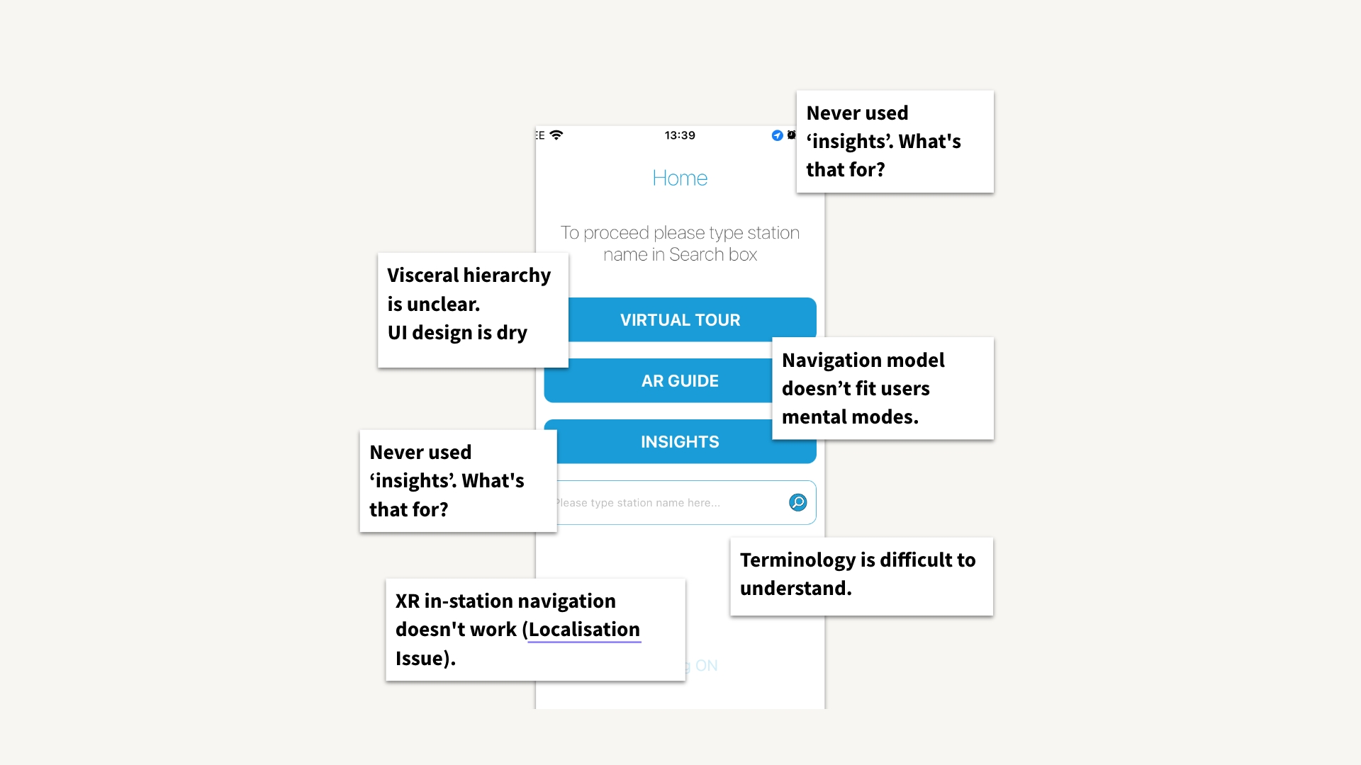
My audit of the existing app, mapped from the passenger's point of view.
Briteyellow wanted to move fast, so before any design started I built the structure that would let three teams work together.
Briteyellow's own team was small: the owner and MD, a project manager, a software developer and an XR consultant. A brand design agency, with a design director and a design lead, joined to cover brand. Rail staff shaped what the app could do. They arranged access to staff for research interviews, explained how the existing technology and customer support worked, and set the technical limits and priorities for the feature set. I was one of the links between all of them.
In the first four weeks we drafted a 6-month project plan covering contractual milestone deliverables, design activities, £200k budgets and signed agreements. It gave the RCA and Briteyellow teams a shared view of what we were doing and why, and it set the pace: we needed momentum in the first four weeks. The programme ran for six months, and I co-signed off the project funds on behalf of the RCA and Innovate UK.
Briteyellow had strong engineers but little experience in product design, user research or brand, so I identified what was missing and found it. I sourced the agency, guided the design brief for Briteyellow to send out to six design agencies, and helped review the proposals.
The team leaned towards an agency strong in brand strategy, and I challenged that. The immediate problem wasn't how Briteyellow looked. It was whether the product worked. I argued that usability and accessibility should come first, with brand following from a stronger product. The team agreed.
We changed the scope to put UX first and added specialist AR support later. It was the moment design stopped being a layer applied to the product and started shaping it.
Time spent setting up contracts and getting outside support signed off had left us on a tighter deadline. I set up weekly catch-ups across all three teams, and combined face-to-face and online sessions with pre-scheduled design and research workshops, so nobody was waiting on a decision.

Who owned what across Briteyellow, the RCA and the outside specialists

The project plan drafted in the first four weeks.
Partway through the project, the agency's engagement ended early over funding and deliverable expectation issues. We still had commercial deadlines ahead and a lot of design left to do.
I had started out coaching and mentoring the team. Now my role had changed towards an acting Head of Design Role. I helped design and finish the interactions, the brand language and the design system, creation of website assets for pitching, and improved accessibility across the app. The project reached its deadlines, and the team kept the capability we had been building.
1. Let the research change the plan
I guided four rounds of research with older adults and coached the team to ask better questions and to separate what people actually did from what we assumed they wanted. We also used project funds to hire an external user research team, who helped plan the last two sessions and analyse the results.
The most important finding was that "older adults" isn't one audience. Independent travellers, people with limited mobility, and people travelling with older relatives all needed different things. That forced the team to decide who the first release was really for.
The final round also showed how much the three platforms undermined each other, which made reliable step-free routing and proactive journey alerts a priority.

2. Rebuild the app around two needs
From the user workshop insights we pushed to restructure the app around two moments: planning a journey at home, and making a journey through the station. That gave users a simpler mental model and gave the team a clear starting point for design and build.
Closely coaching the Briteyellow leadership team we mapped the whole journey, from planning to reaching the platform. This made risks visible early: conflicting information, inconsistent screens across platforms, accessibility gaps and unclear ownership between teams.
Rather than trying to remove all uncertainty, I made sure the Briteyellow team could see what mattered while there was still time to act.
The redesign focused on confidence: larger touch targets, clearer type, high contrast, familiar interactions and an easy way to get help. We also avoided stereotypical imagery of ageing, because the app needed to feel like a capable companion, not a tool "for old people."

The new structure: planning a journey, and making a journey.

The journey map the team used to spot risks before build. Details blurred.
"This is a step forward, a vast improvement on the previous version".
"The whole thing is 100% better and much more user-friendly."
"This feels like a higher standard product."
- Participant quotes
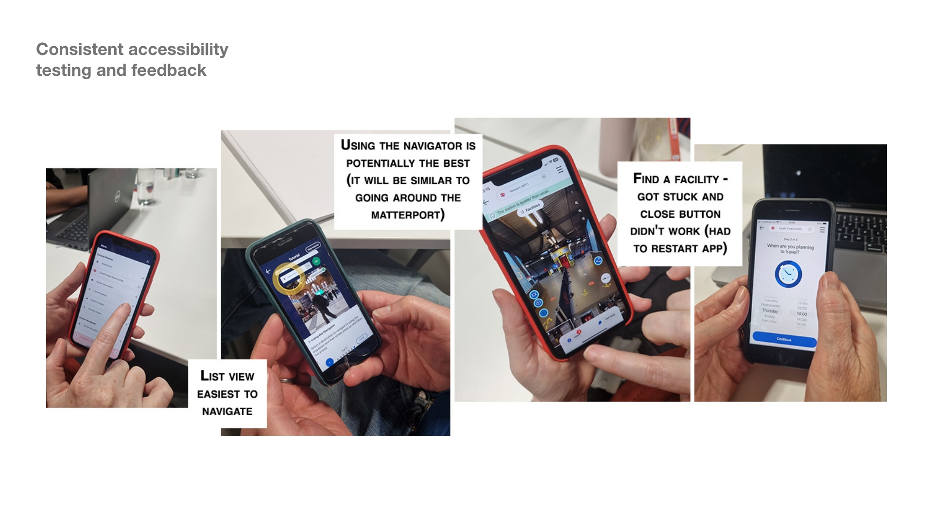
Feedback on accessibility from the final research round.
With the product direction clear, I worked with the leadership team on what Briteyellow stood for. Together we shifted the story from "technology that helps people navigate stations" to confidence, independence and more inclusive travel.
We wanted an identity that felt contemporary, optimistic and inclusive, positioning Briteyellow as a technology company creating better experiences for passengers, not a product for older people.
Three principles guided the work:
• clear rather than technical,
• reassuring rather than paternalistic,
• and inclusive without making accessibility an afterthought.
We used them as a checklist across the app, the AR experience and the wider service. That kept the brand and the product telling the same story, so what we promised commercially matched what we were actually designing.
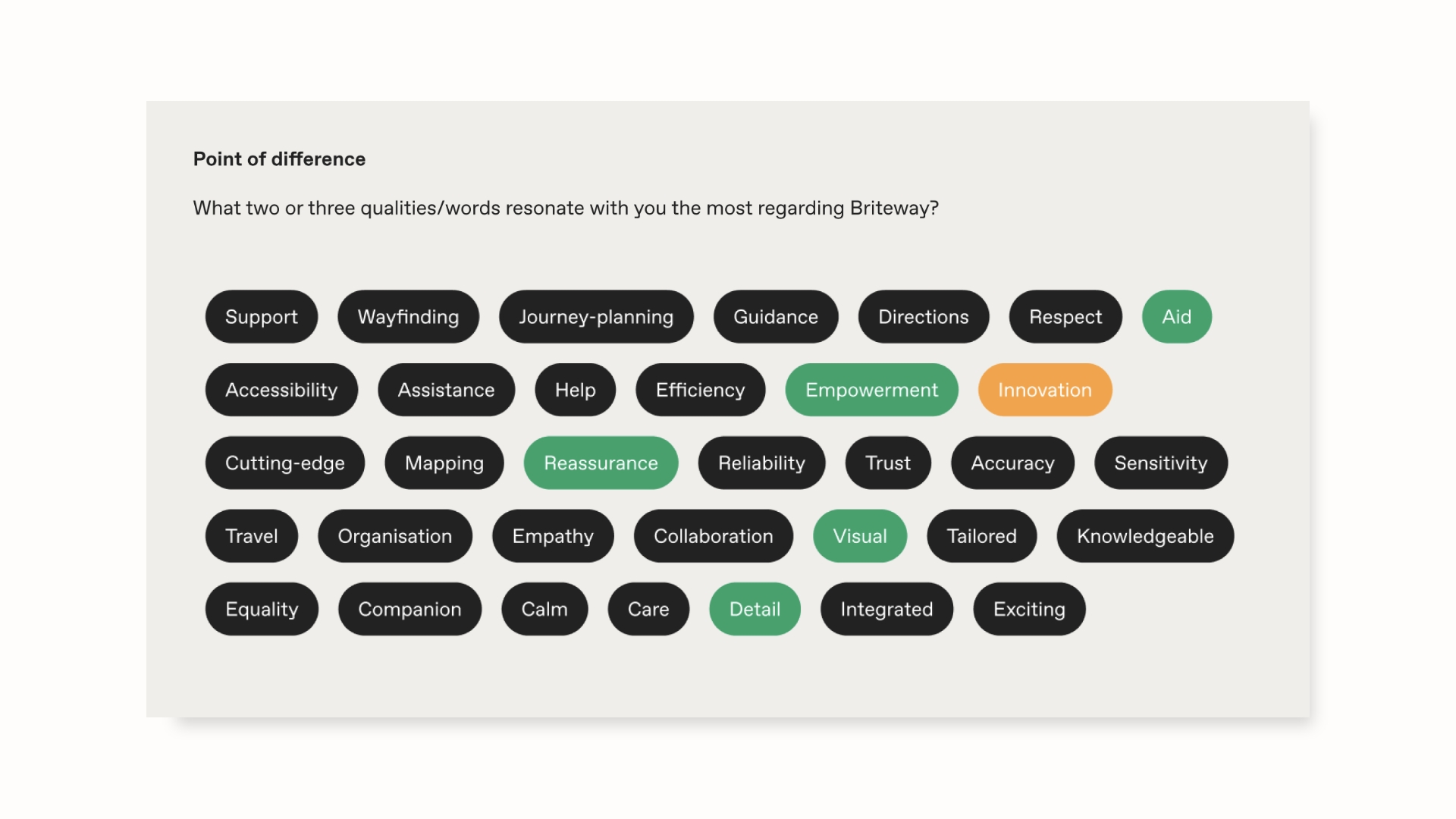
What makes Briteyellow different, drawn from the user workshops.

Brand strategy built from the research and the product principles.

The most important design decisions often happen before anyone opens Figma. Briteyellow didn't need another person to make screens. They needed someone to connect technology, user needs, design and commercial reality, and to give the team the confidence to make decisions. That was my role.
The agency leaving early taught me something else: agree funding, deliverables (with scope) and payment terms with everyone before the work starts, because a gap in alignment can derail a plan.
1. Emotional needs: what older travellers need in order to feel reassured, empowered and supported. This fed the brand work later.
2. Structure: testing the new app layout, which was clearer but showed missing information on platform changes, accessibility and timing.
3. Audience: discovering that older adults weren't one group, which forced a decision about who the first release was for.
4. Technical reality: exposing the inconsistencies from joining three platforms.
During the four rounds of user workshops, I had coached the team's mindset in how ask better non-leading questions, observe behaviour and to separate what users actually experienced from assumptions.
A few developed questions driven from the coaching included:
• When would you want or need to use this app?
• What would you want it to prioritise?
• What did you think of using AR?
• How did you find navigating the features?
• Why did you take that action? What did you expect to happen?
• What would stop you using it more often?
• Attitude to travelling and exploring new places
• Homebound vs independent (limited mobility or restricted health)
• Comfort with, and exposure to, new technology

I ran an internal workshop to separate essential features from future ones, which gave the commercial team a clear, phased story for what would come in each release.

The biggest risk wasn't whether we could build the technology. It was whether the different parts of the product would work together for someone using it under pressure. I used the customer journey, the site map and the research findings to bring problems into view to leadership while there was still time to fix them.
These included inconsistent screens across the three platforms, duplicated or conflicting information, gaps in accessibility, unclear ownership between teams, and technical dependencies that affected the passenger's journey. It also showed us which features were valuable but not essential for the first release. Rather than trying to remove all uncertainty, my role was to make the important risks visible early enough for the team to make better decisions.

The redesign wasn't about making a sophisticated technology easier to understand. It was about making the passenger feel in control.
We made touch targets larger, the typography clearer and the contrast higher, and we kept interactions familiar so nobody had to learn something new in a stressful moment.
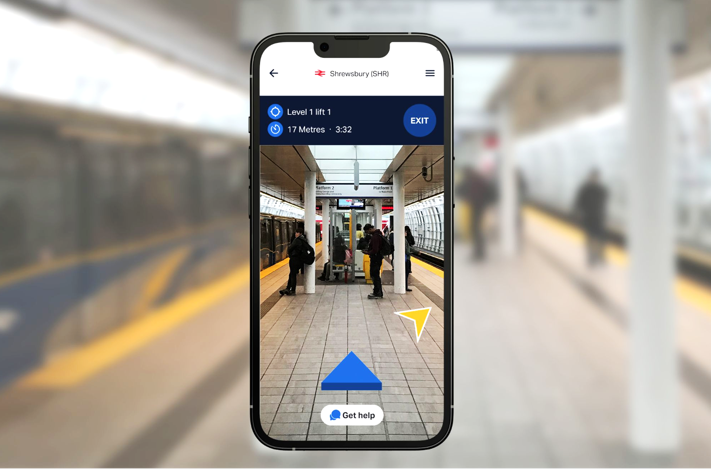
The look and feel stayed consistent across the AR and digital experiences, journey information appeared in context at each stage, and navigation was designed around accessibility. We also made support and emergency options easy to find.
The visual language moved away from stereotypical images of ageing, because the product needed to feel contemporary, capable and trustworthy.


Designing to improve the lives of older and vulnerable people.


